CEP America (now known as Vituity) is a physician-led and physician-owned Partnership, that combines clinical excellence with business acumen to help healthcare organizations raise the standard of patient care and improve their performance metrics.
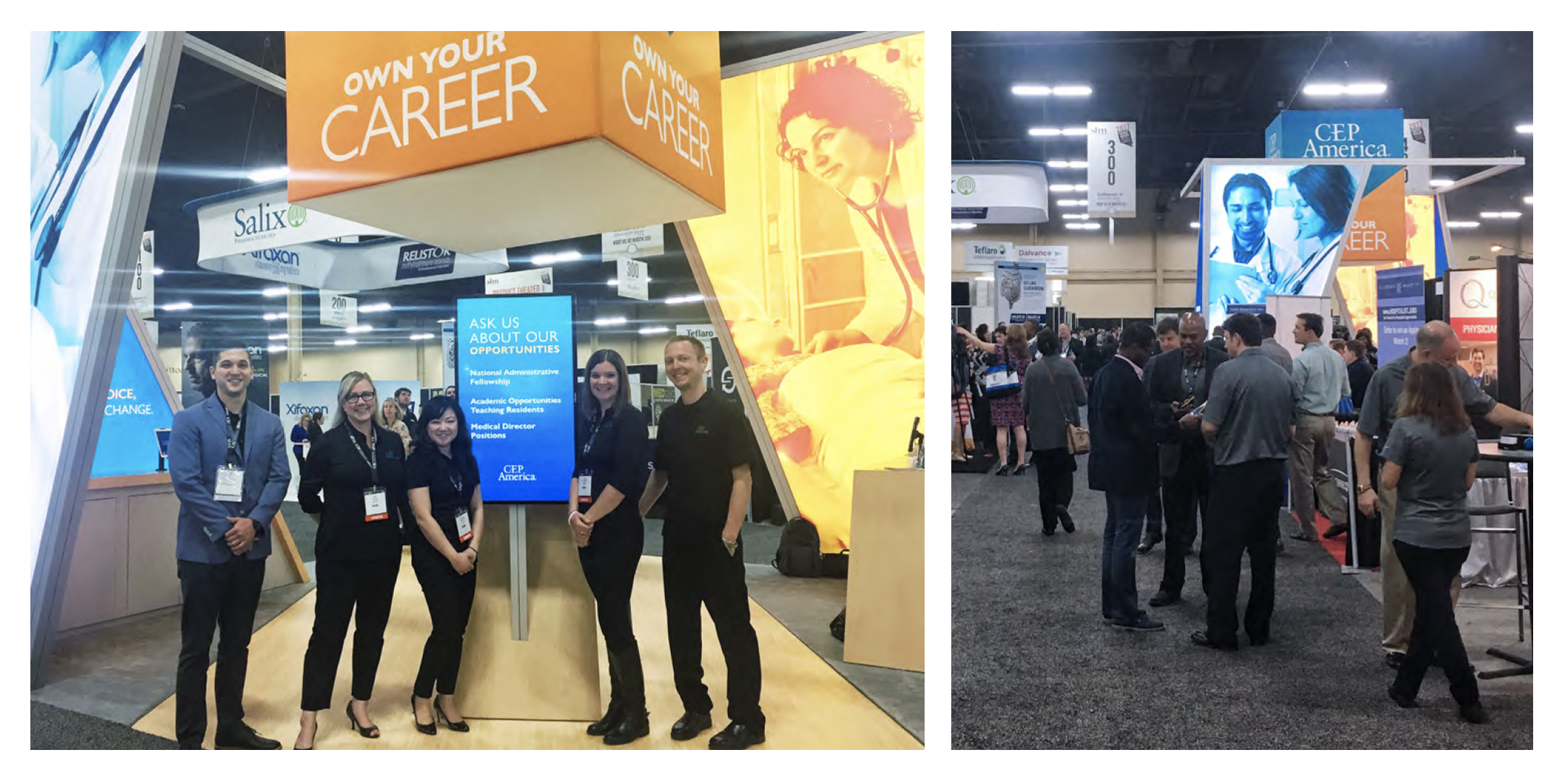
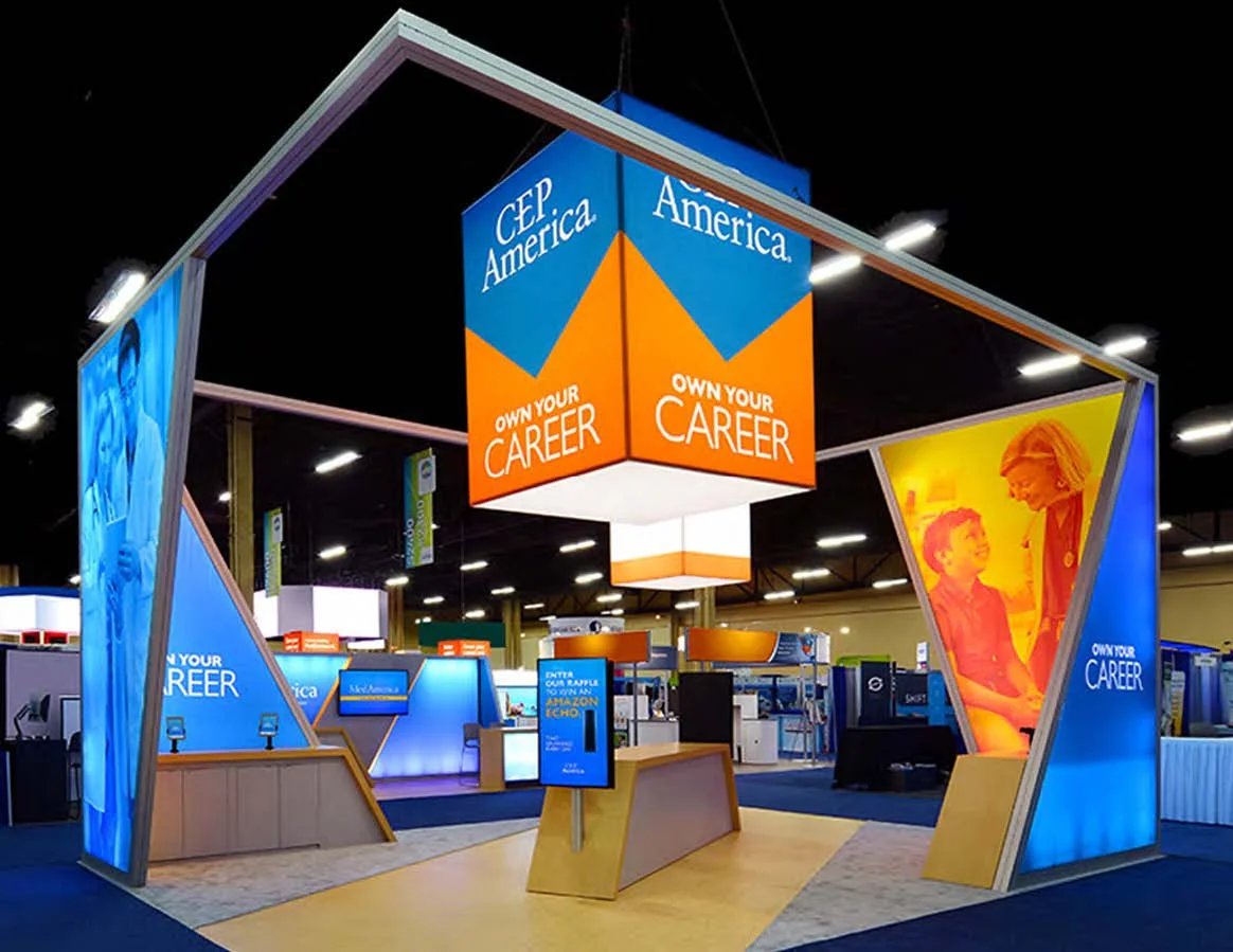
As a sponsor of the 2017 Society of Hospital Medicine (SHM) trade show, CEP America launched a new recruiting campaign: Own Your Career. CEP America had greater visibility than in years prior and Leadership desired a new look for a 20’x20’ booth — a first for CEP America. Deliverables: Design a modern and inviting 20’x20’ booth, refreshed brand messaging, branded marketing collateral, and art direction.
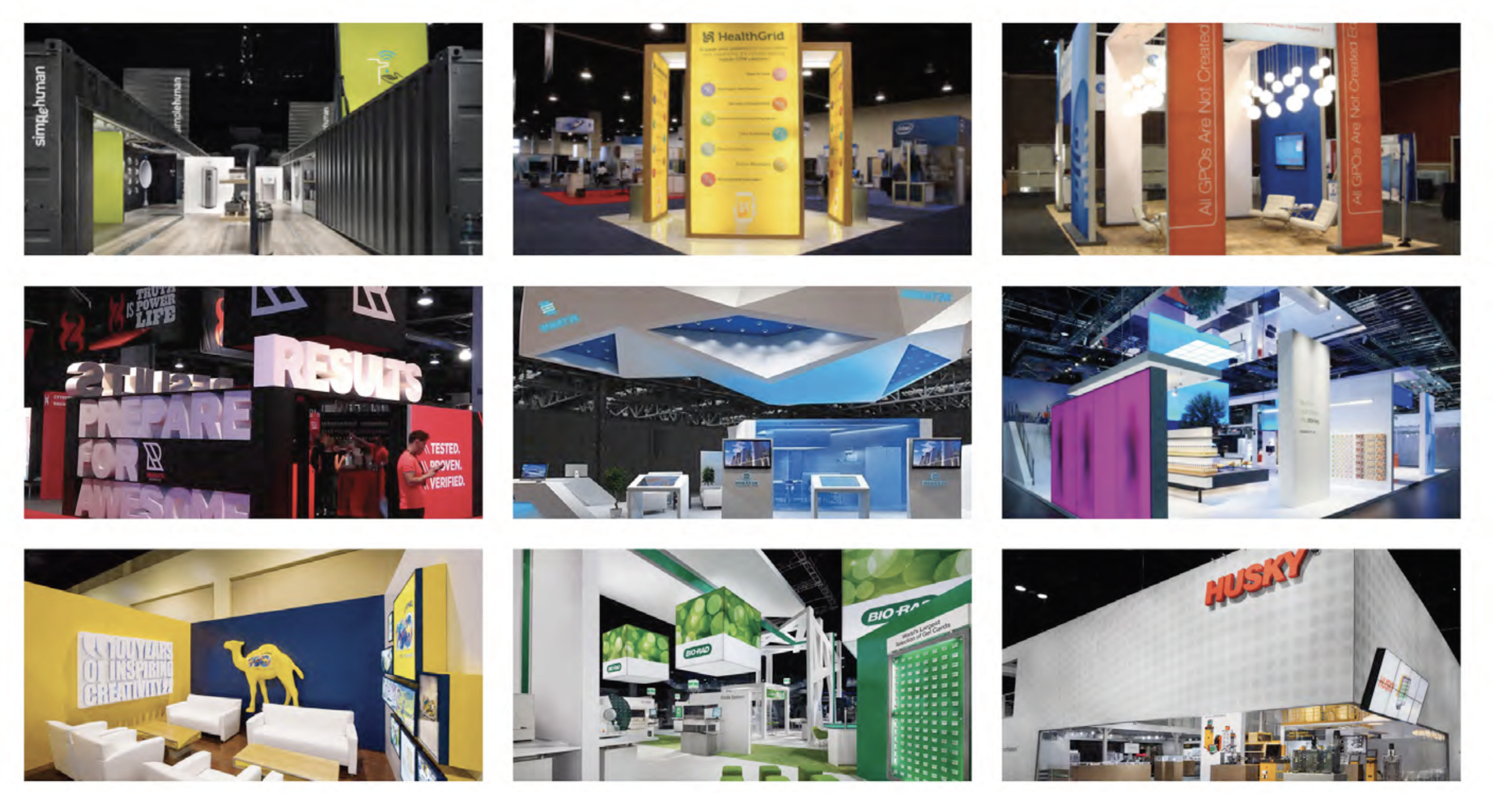
Research: Inspiration
Research by way of inspiration is one of my favorite ways to dig into a project. In addition to looking at booth designs within the healthcare space, I wanted to know what other mid-size B2B and B2C companies are bringing to trade show floors. Above is a sampling of the visual variety across various industries.
Observations
Style Modern and sleek style
Color 1-2 bright/bold with a neutral
Type Sans serif, bold/heavy
Lighting Bright, clean, LED
Objective To create an experience/welcoming
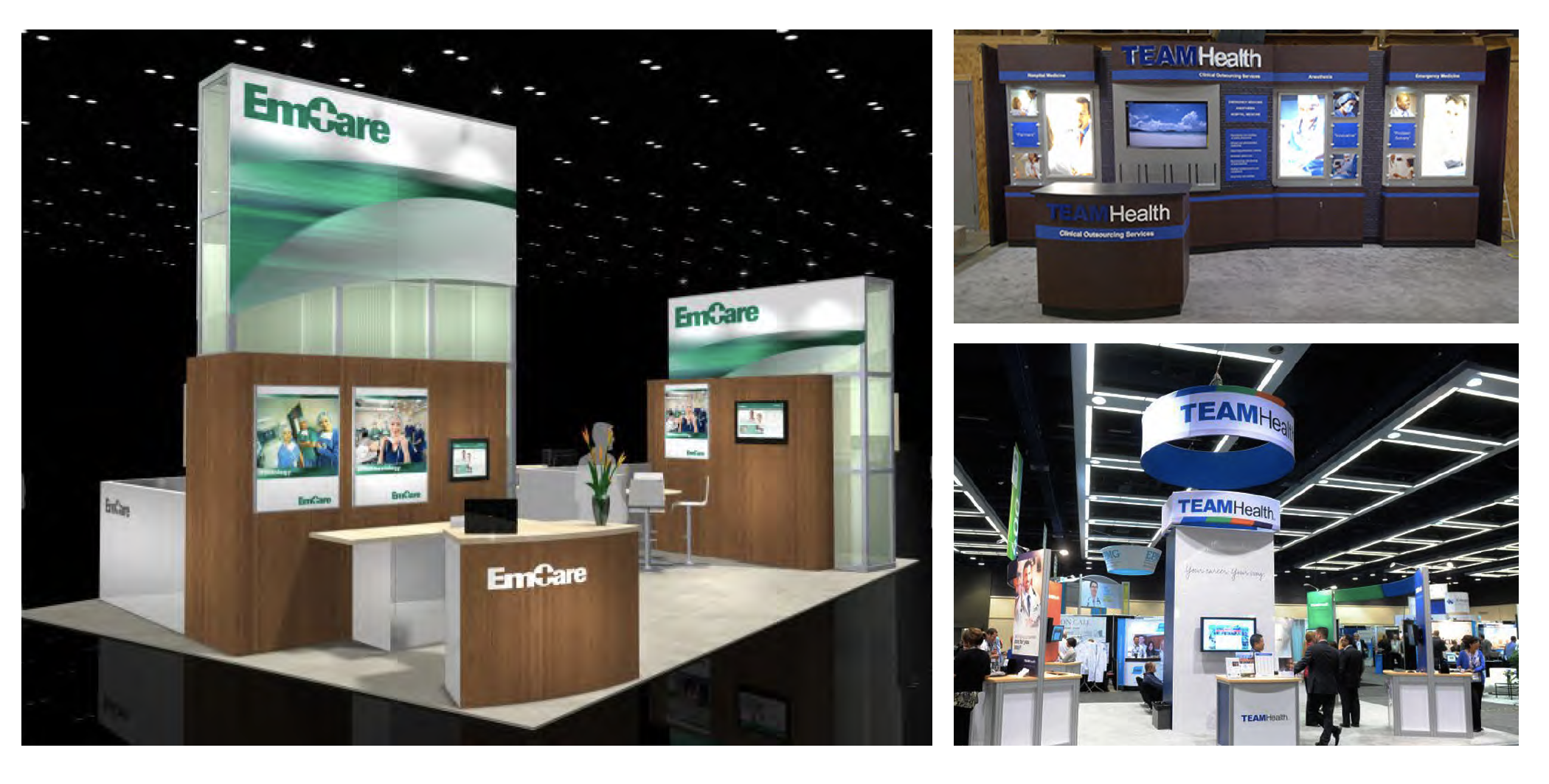
Research: Competition
Assessing what the competition is up to always motivates me to conceptualize designs that will standout on the show floor with the goal of attracting top talent.
At left are redesigns for both EmCare and TeamHealth. EmCare keeps with a more clinical approach through walnut veneer and dated gradients, while TeamHealth moves from cherry wood and dark colors to a more generic modern look. While I agree the newer TeamHealth booth is an improvement, I wasn’t a fan of the layout: no exterior frame. It’s hard to know where TeamHealth begins and ends, leading to fewer unique leads.
One takeaway is that when considering competition, it is critical to consider how a booth will appear among other booths.
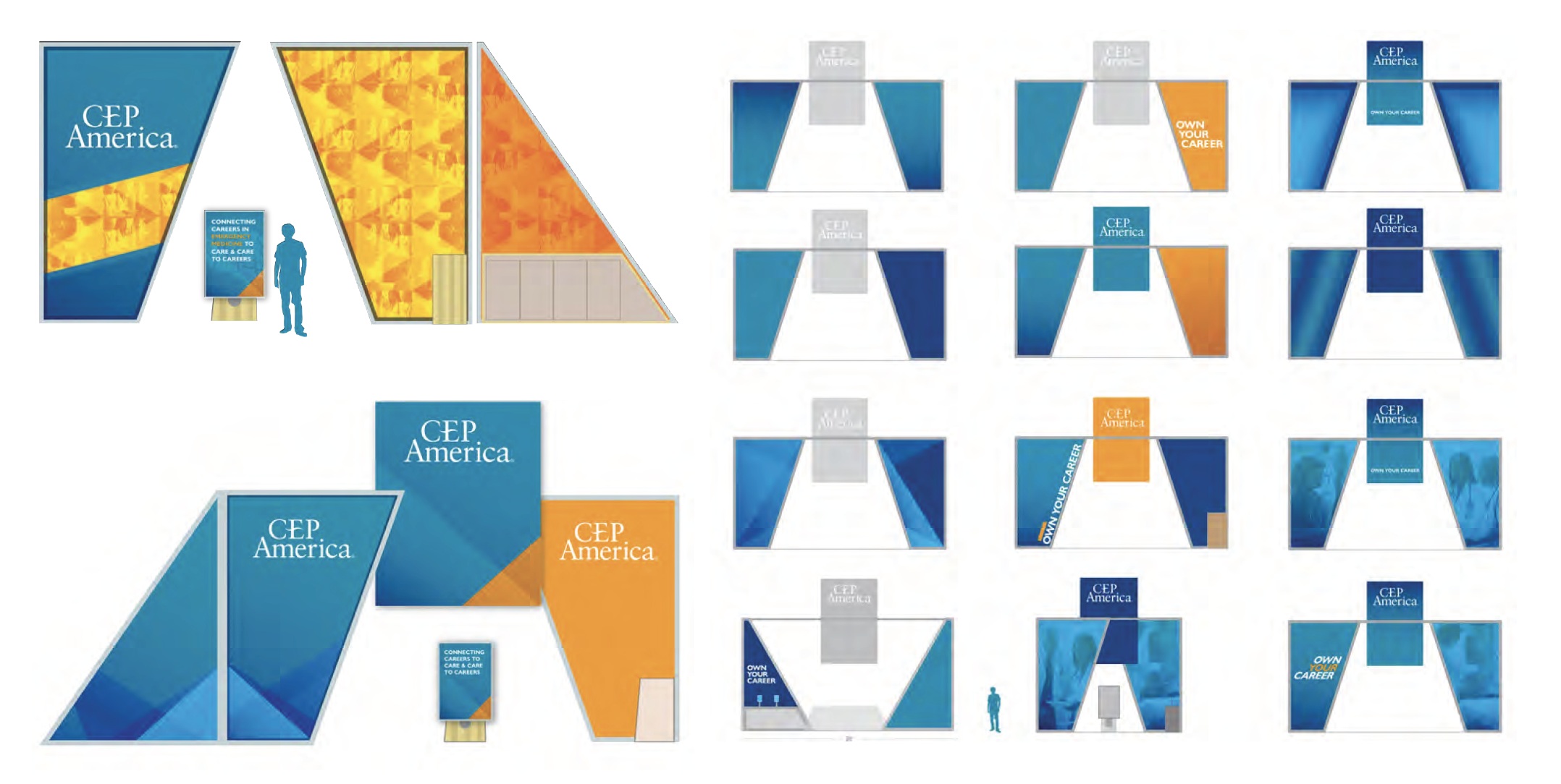
Design Phase I - Color Exploration
Design Challenges One of the leading design challenges was the existing CEP America design approach. Design was an afterthought, and rooted in a fairly conservative and uninspired aesthetic (think red, white and blue with a serif similar to Times New Roman); and despite a projected rebrand launch in 18 months, I felt it was critical to refresh our CEP America aesthetic. I made the case to stakeholders that if we wanted to attract top talent on the trade show floor, we would need our marketing collateral and booth to appear current and inviting. Another benefit of the redesign was that we bridged the transition from a CEP America to our new brand with greater buy-in.
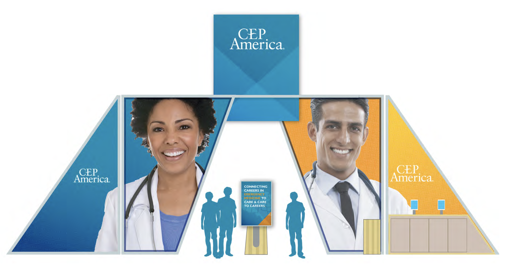
Design Phase II - Approved Design
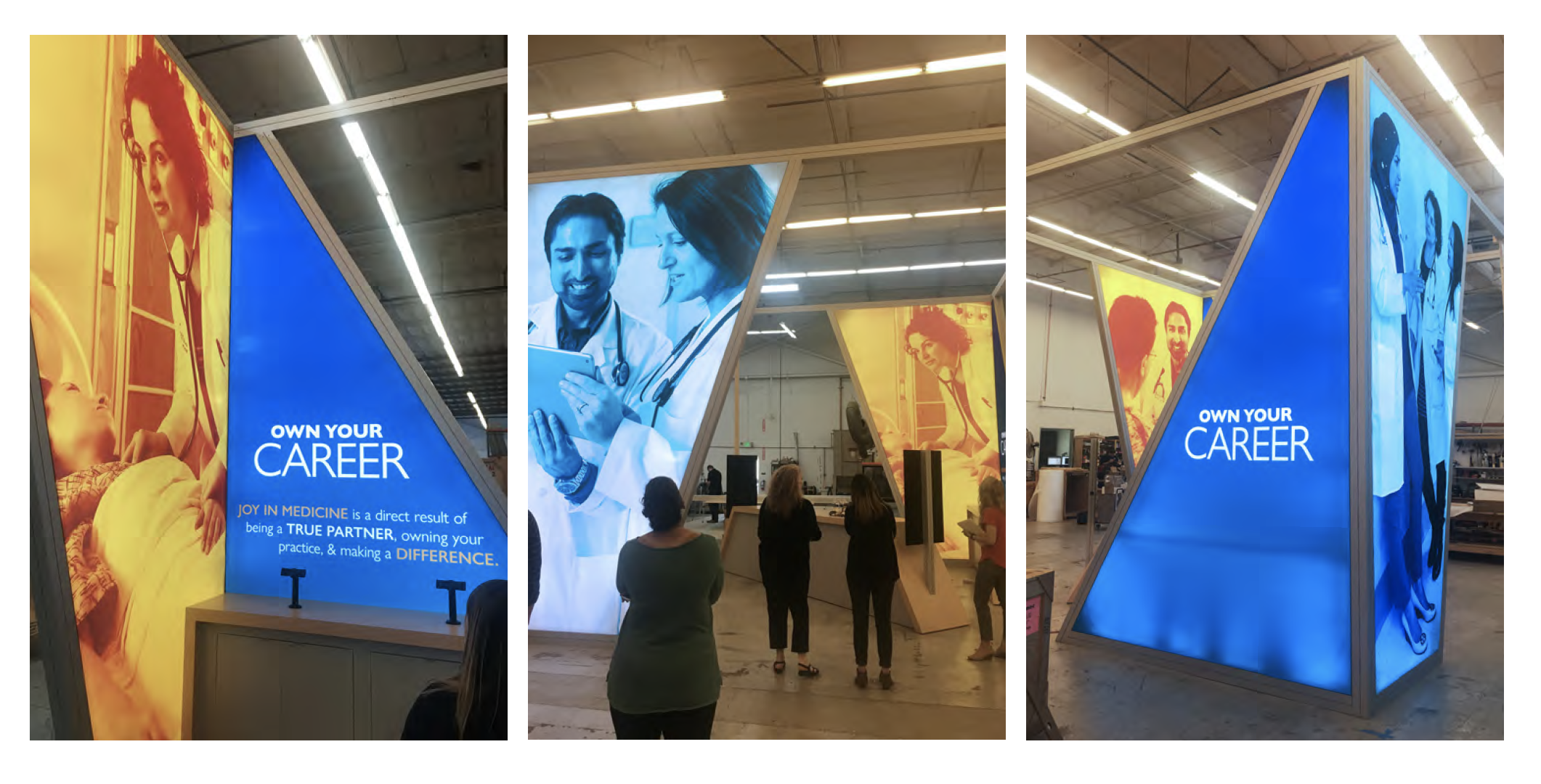
Design Solutions One of the key identifiers of being a CEP America physician provider is that we are a physician-led and physician-owned Partnership. Keeping that in mind, I pushed to use photos of our own providers within the specialty line featured, in this case, Hospital Medicine. (More on this later).
I wanted to create an inviting and fluid open space with a warm interior color, light hardwood and multiple entry points.
Another goal was to incorporate our recruiters booth needs and to integrate messaging across various platform - from the large fabric panels to monitor messaging and iPads. There would be something for every attendee to feel welcome.
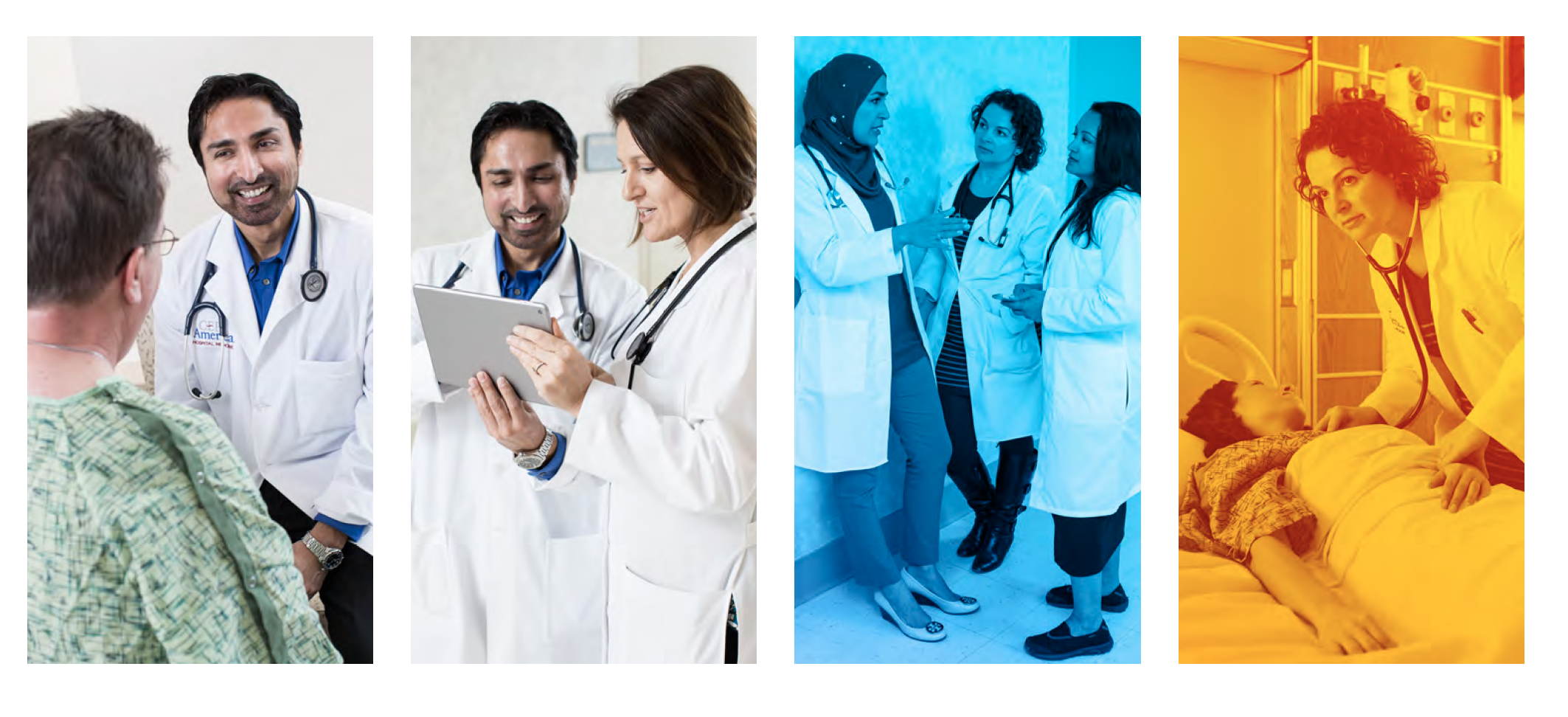
Photography Phase II + Selects + Edits
As I mentioned under design solutions for the approved booth design, we used our own Physician Providers and colleagues as models. Using real people as models comes with some art directive challenges, it was well worth it and emphasized what our Partners mean to our organization. We wanted to show genuine compassion and camaraderie.
It was also important to cast Partners that represented the company’s diversity, from race to gender to leadership.
We received a very positive response from our hospital medicine providers who were thrilled to see their colleagues on 15-foot panel displays.
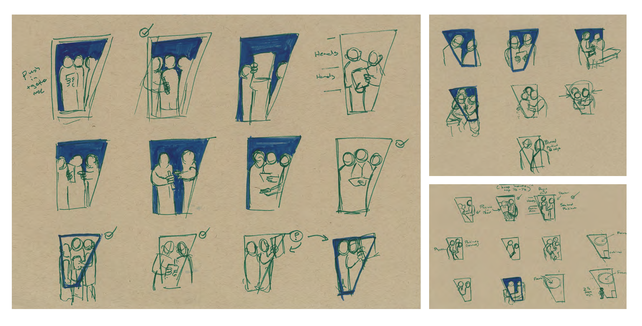
Photography Phase I + Art Direction
Once we contracted a photographer that could capture the personable yet clinical feel we were looking for, I sketched mock ups for how we might photograph our providers within the confined panel shape. When you’re on set, it’s easy to forget a priority image or two, so a shoot list, complete with sketches helps us stay on track. The sketches proved helpful for the physician providers who had never modeled before.
In addition to working within a defined vertical space, we had four opportunities to highlight different relationships. From physician camaraderie to physician collaboration to one-on-one patient care. We wanted to be sure trade show attendees saw a genuine glimpse of the kind of work and relationships we have at CEP America.
Quality Control + Booth Fabrication Preview
There are many phases within the quality control and approval process when working with an exhibitor vendor. Before we can walk-through the booth, we receive color proofs, fabric proofs, counter and floor samples. The list continues. But all that feedback is worth it once you see panels lit and upright with our providers’ faces glowing at 15 feet.
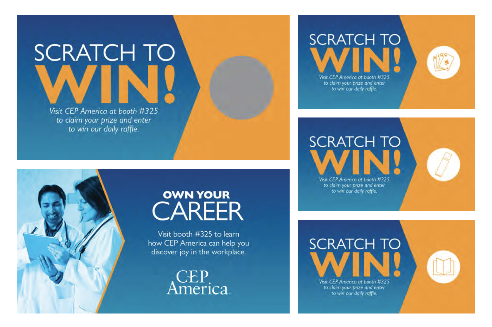
Swag Deliverables
In addition to designing an eye-catching booth, it’s important to have booth drivers. If you’ve attended a trade show, it’s impressive how much people love their swag.
While we want to give the people what they want - I wanted to present their options in a playful way. So, when in Vegas, why not scratchers? Attendees could win either a set of branded playing cards, chapstick (a surprising trade show swag favorite) or a coloring book. Because we were sponsors of the show, we also had water bottles that were given to every attendee at check-in, with a scratcher and bookmark inside.